
The latest release updates the Findhelp dashboards with new branding graphics and color schemes, shifting focus toward time-series data and detailed tables. To keep this update concise, charts that only received color adjustments are not shown below.
Trusted Networks Dashboard Updates
What's New
- Style Changes: the most notable change to this dashboard is the color scheme and move away from mixed line/bar charts to line charts.
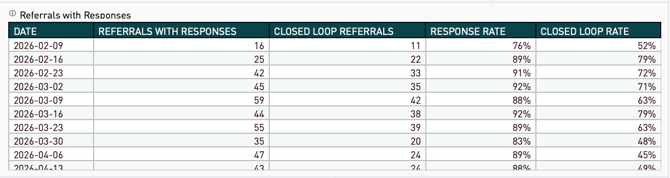
- Referrals w/ Responses Data Table: addition of the referral and closed-loop response rates in a data table that is displayed by the selected aggregation period.
Legacy Dashboard Layout:
.png?width=670&height=150&name=image%20(6).png)
New Dashboard Layout:
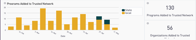
Minor changes to the arrangement of the big numbers to make the dashboard easier to read and to follow the style of other big numbers on the dashboard.
Legacy Dashboard Layout:
New Dashboard Layout:
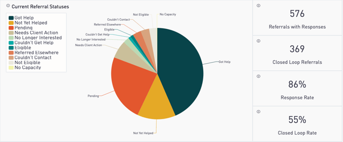
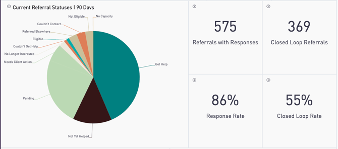
Minor changes to the arrangement of the pie chart and big numbers to make the dashboard easier to read.
Legacy Dashboard Layout:
This dashboard did not exist previously.
New Dashboard Layout:
Legacy Dashboard Layout:
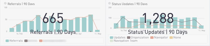
New Dashboard Layout:
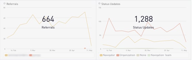
The only change is migration away from the combined line/bar chart to a line chart only. The time frame was removed from the chart title and overlay to ensure a more readable design. The time frame still appears in several places on the overall dashboard.
Legacy Dashboard Layout:

New Dashboard Layout:
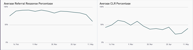
The only change is migration away from the bar chart to a line chart.
Supply & Demand Dashboard Updates
What's New
- Search Share by Type Table added search share by type percentages table to show share of program, postal, and api based searches as a % of the total searches.
Legacy Dashboard Layout:

Removed this message from the top of the dashboard as the charts respond to geo filters.
Legacy Dashboard Layout:
New Dashboard Layout:
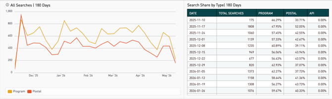
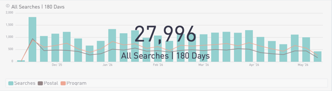
All Searches changed to a line chart from a mixed bar/line chart. Search Share by Type table added to provide % share of total search volume by type.
Legacy Dashboard Layout:
New Dashboard Layout:
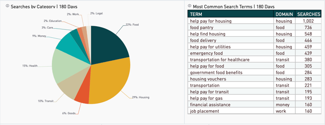
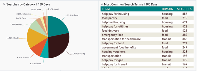
Only minor changes outside of visual colors and lines for the data table. The data table now shows 20 results versus 15 due to changes in screen real estate.
Site Referral Details (PII) Dashboard Updates
What's New
- No visual changes to this dashboard, it remains at three data tables.
Group Based Site Referral Details (PII) Dashboard Updates
What's New
- No visual changes to this dashboard, it remains at three data tables.
Group & Navigator Activity Dashboard Updates
What's New
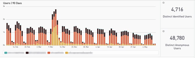
- Replaced Identified/Anonymous Users - Now providing Logged In/Visitor Counts instead of identified/anonlymous user counts.
- New User & Visitor Count Charts - Now providing longitudinal data for logged in users and visitor counts in bar and stacked bar charts.
- New Logged In Users & Total Site Traffic Count Data Tables - removed the big numbers for distinct identified users and distinct anonymous users in favor of logged in users and total site traffic counts by subdomain.
Legacy Dashboard Layout:
New Dashboard Layout:
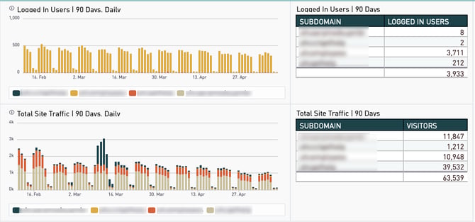
Replaced Identified/Anonymous users with Logged In/Total Site Traffic Counts. Replaced the big number charts with data tables that display counts by subdomain. Added individual charts for logged in users and total site visits. Both are segmented by subdomain using stacked bar charts.
Legacy Dashboard Layout:
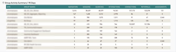
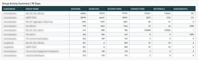 Minimal changes outside of visual colors and lines for this data table. Site column renamed to Subdomain.